
Why now?
Progressive sign-up, an onboarding strategy with a real trust tradeoff.
Progressive Sign-Up
Let’s quickly define this.
Progressive sign-up is an onboarding strategy where a product asks for the minimum information needed at first, then collects more information later when it becomes relevant. In plain language: the product only asks for what it needs to create the account. More information is gathered later.
For example, at Pluto TV, the initial account form asked users for email address, password, name, gender, and date of birth. That was enough to “complete” an account. But, over time, there were also discussions about collecting ZIP code after sign-up. From the business perspective, ZIP code could support better geo-targeting and advertising relevance. From the user side, though, this creates a different question: If my account is already complete and active, why are you asking me for more information now?
That is where progressive sign-up gets interesting. It can reduce friction upfront, but it also creates new trust risks later.
Let’s look at a simple pros/cons list for adopting this strategy:
| Pros | Cons |
|---|---|
| Faster sign-up Fewer fields upfront makes it easier to create an account. | Users may feel surprised later If the product asks for more information later, users may feel like the first sign-up was incomplete or misleading. |
| Less pressure upfront Users do not have to make a big commitment before trying the product. | Important actions may get interrupted A user may be ready to watch, buy, post, or redeem something, then suddenly gets blocked by another requirement. |
| Information is collected in context Asking for data later can feel more reasonable when it matches what the user is trying to do. | The account state can become unclear Users may not know whether their account is fully ready, partially complete, or limited. |
| Better conversion More people may complete the first account step. | More risk of low-quality or abusive accounts Bad actors can also create accounts more easily if the first step has very little friction. |
| Can feel respectful of user privacy The product avoids asking for unnecessary information too early. | Can feel like a bait-and-switch If later asks feel too big or poorly explained, users may wonder why the product did not mention them earlier. |
“Why now?”
Progressive sign-up is one version of a broader pattern: asking users for information over time instead of all at once.
A common example is the classic e-commerce popup: “Would you like 15% off?” I used to buy too much sports merch online, so I have seen this pattern everywhere. Many marketplace sites show this popup immediately after you land on the homepage.
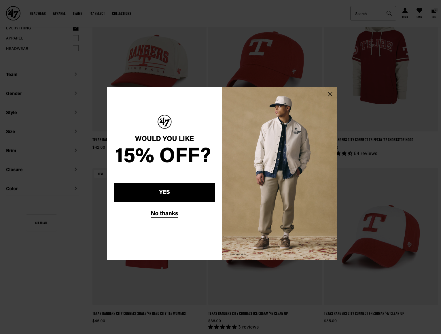
The problem is mostly timing. At that moment, I may not even know if I want to buy anything yet. I have not browsed the products. Nor have I compared prices between sources. So when the site asks for my email right away, the offer may be useful, but the timing makes it feel interruptive: “I don’t even know if I need this 15% off.”
Coming back to progressive sign-up, every progressive data request has to answer one question: “Why are you asking me this now?”; If the answer is obvious, the ask feels reasonable. Otherwise, it feels suspicious.
In the sports merch example, a better pattern might be to present the 15% off option in a less interruptive way during browsing, or bring it back closer to checkout when the user has shown stronger buying intent.
The same principle applies to account creation. For example: “Add your birthday so we can show age-appropriate content” feels understandable. Whereas “Enter your birthday to continue” feels arbitrary.
The point is simple but important: Progressive sign-up only works when the data collection is tied to a user-visible reason. The product may have a business, a compliance, or a safety reason, but if the user cannot understand why the request is happening at that moment, the system starts to feel less trustworthy. It is obvious that introducing this strategy can reduce friction at the beginning, but it creates a new design responsibility: the product has to explain why more information is needed, why now, and what the user gets in return.